APS Design system, from component library to scalable design system
Role : Design system lead + Research + Management
This case study shows how I evolved MUI into a brand-aligned, responsive, and accessible design system that supports light/dark themes and client-specific customization at scale..
Overview
At APS, we use Material UI (MUI) as the foundation for our front-end development. While MUI enabled rapid UI implementation and accelerated development, it was primarily used as a raw component library rather than a scalable, branded design system. As our products grew, including both internal tools and client-facing platforms, this started to cause friction in both design and development.
My role was to evolve MUI into a production-ready design system aligned with APS’s branding, accessibility standards, multi-device requirements, and future product strategy, in close collaboration with front-end developers.
Our challenges with MUI
Through research and interviews with stakeholders, designers, and developers, I gained a better understanding of the challenges that MUI design system was causing within APS:
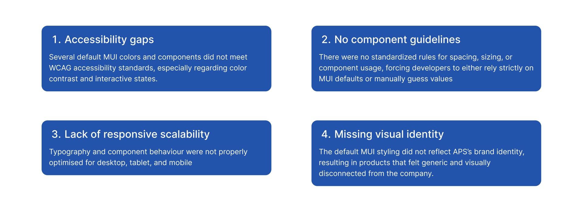
Challenges
These challenges made it difficult to scale APS’s products consistently, slowed development over time, and limited our ability to deliver accessible, branded, and client-specific digital experiences. Addressing these issues required a shift from using MUI as a component library to building a true, scalable design system on top of it.
Design system roadmap
Before starting the design work, I created a clear plan with a high-level timeline to align with senior management on scope, priorities, and expectations. This helped set a shared understanding of the process, needed resources, and what we aimed to deliver within a realistic timeframe.
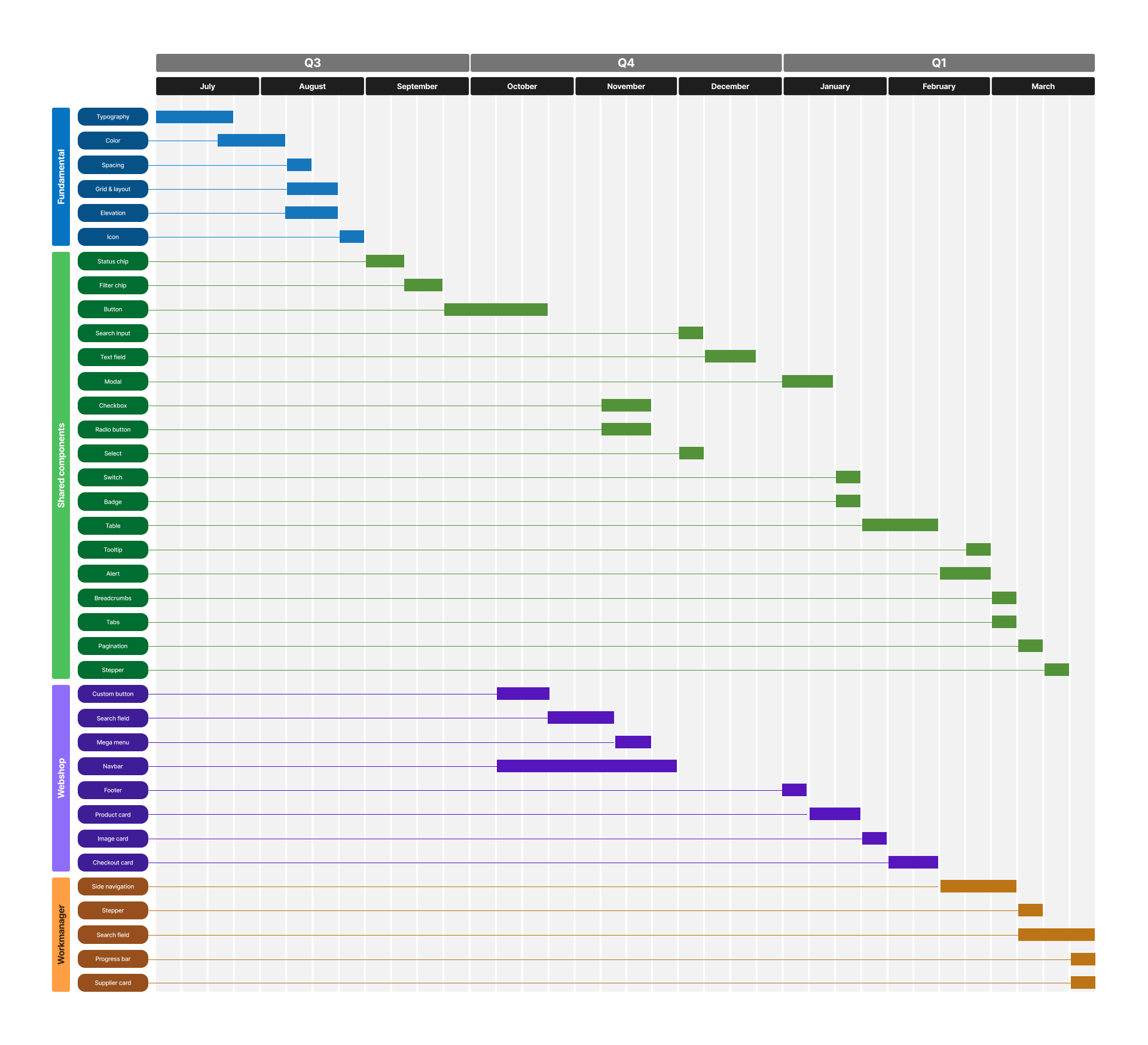
Design system roadmap
Design tokens as the foundation
I started by establishing a solid token structure to make the system scalable and consistent. I created a clear set of typography tokens and significantly expanded the color tokens
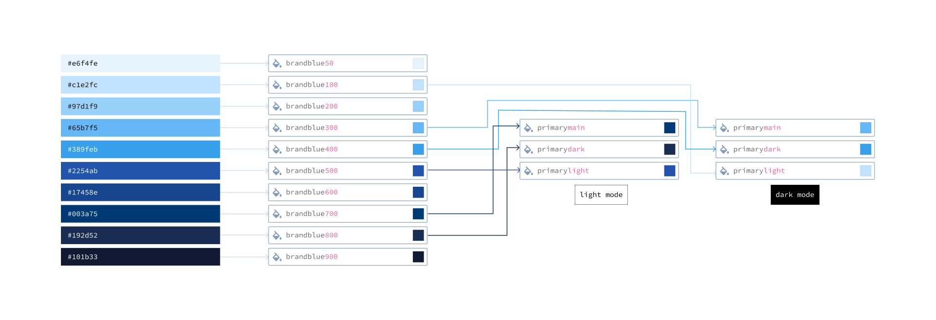
Color tokens
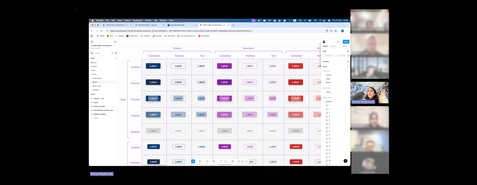
Staying Close to MUI to Support Developers
To avoid design–development drift, I intentionally kept MUI variants as the core of our components. This ensured that designers stayed aligned with what developers could realistically build, while still allowing enough flexibility to meet our product and brand needs without the need to detach the components.
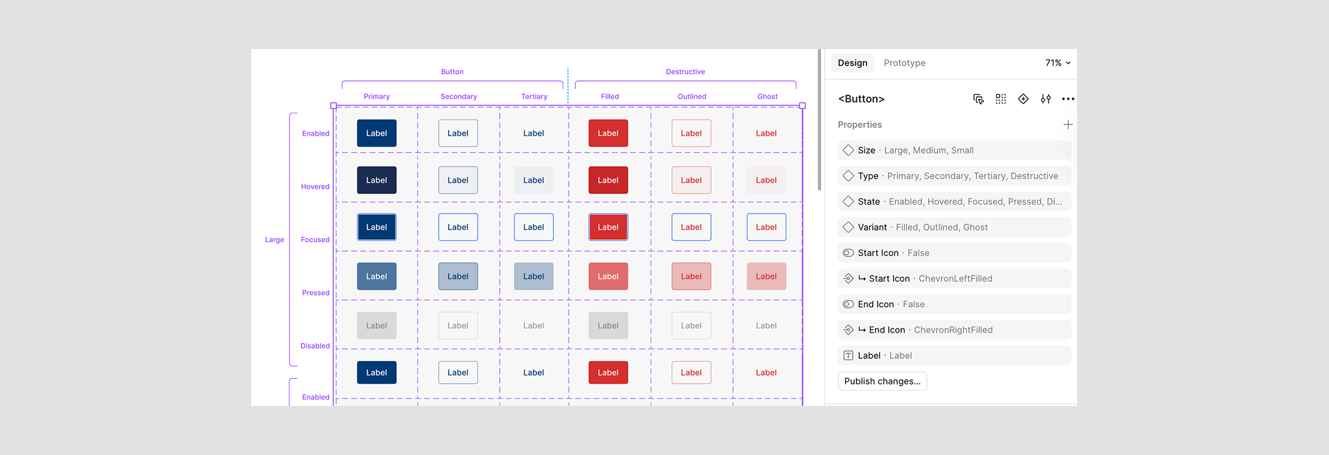
Figma variants
Accessibility as a Core Requirement
Accessibility was treated as a first-class requirement, not an afterthought. I validated color contrast, interactive states, and component behavior against WCAG guidelines, and adjusted both tokens and components where needed to ensure inclusive use across all products.
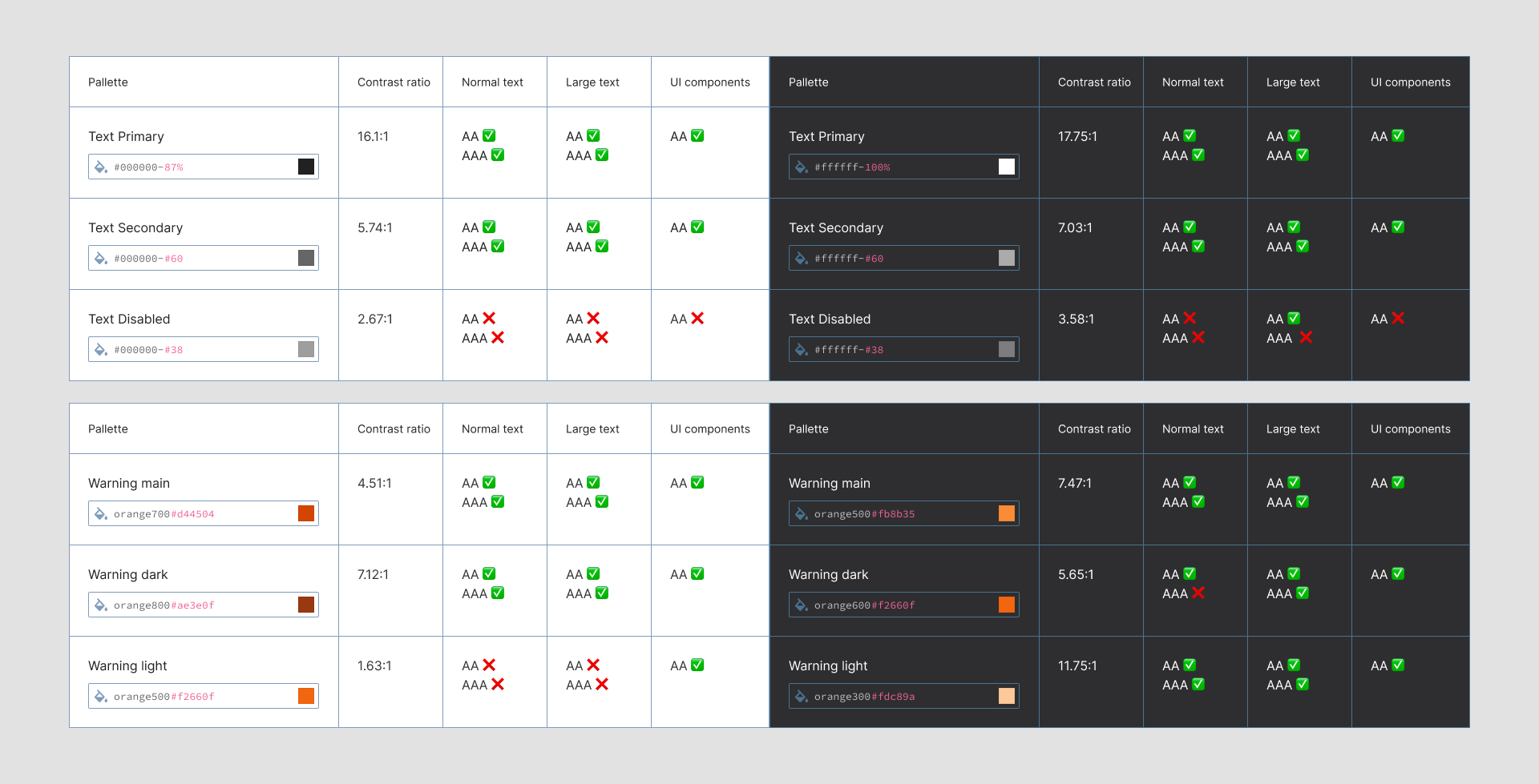
Contrast check
Light & Dark Mode by Default
All tokens and components were designed to work seamlessly in both light and dark mode. This was built into the system from the foundation level to ensure consistency, usability, and accessibility across different environments.
Light/dark mode
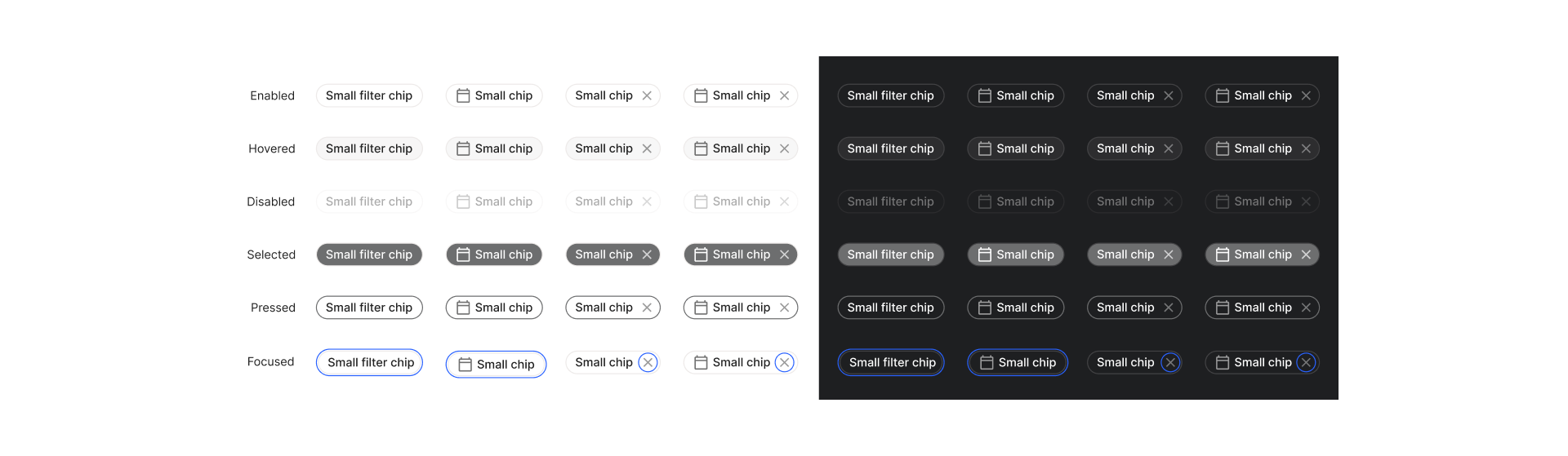
Clear, Practical Component Guidelines
To eliminate guesswork and inconsistencies, I created detailed usage guidelines for all core components. These included spacing, sizing, states, do’s and don’ts, and real use cases
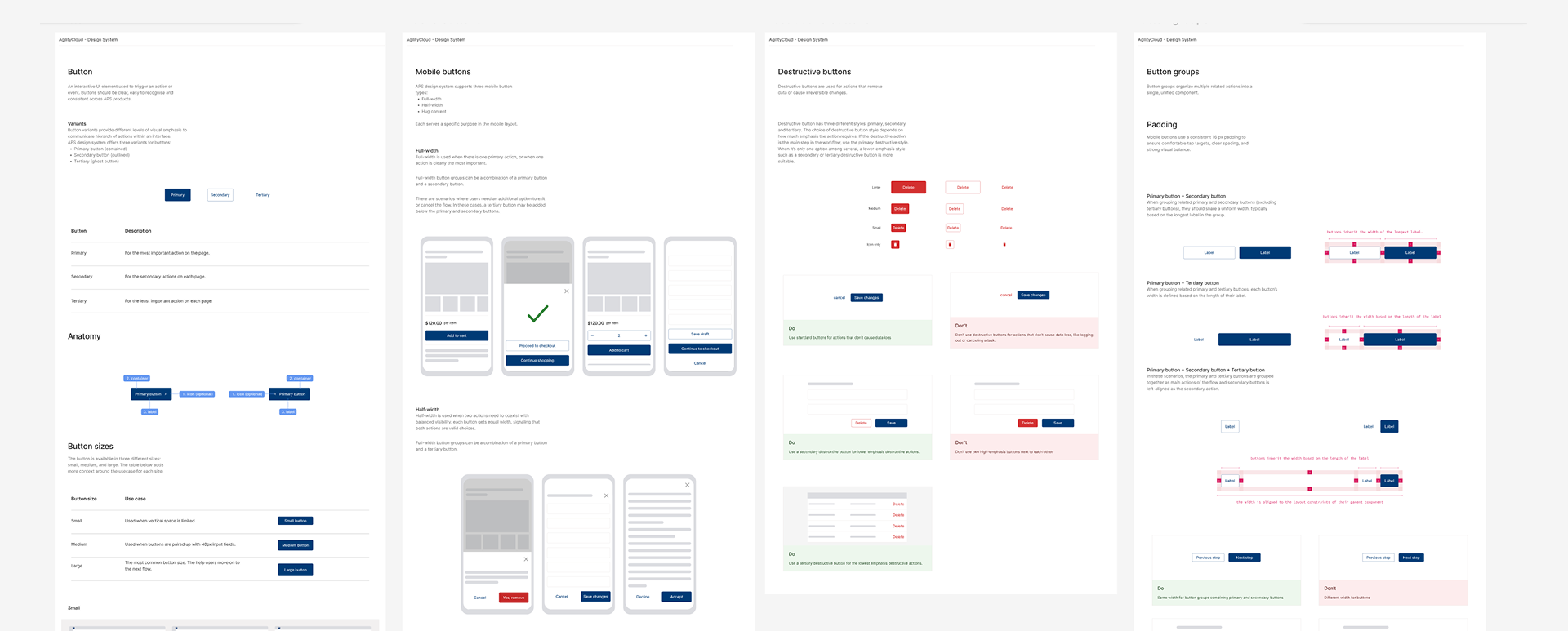
Design guidelines
Themeable for Multiple Clients
I made the system fully themeable for client-facing applications and actively tested components with different color palettes and brand identities. This allowed us to validate visual consistency, accessibility, and flexibility across multiple client implementations.
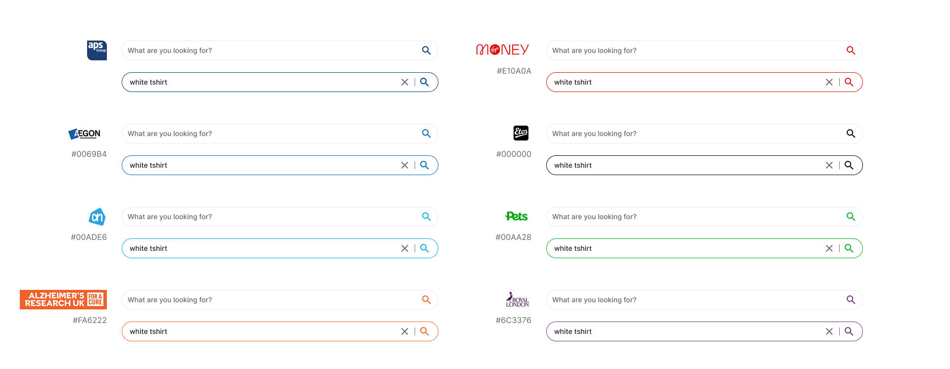
Client theme
High-Contrast Mode for Real-World Client Branding
Our platform promises deep customization for client branding, but in reality, some client color palettes are not accessible and can create serious usability issues. To address this, I proposed a high-contrast version of the product that works alongside client themes. This ensures that we can always offer an accessible alternative, even when custom brand colors don’t meet accessibility standards, without breaking the promise of customization.
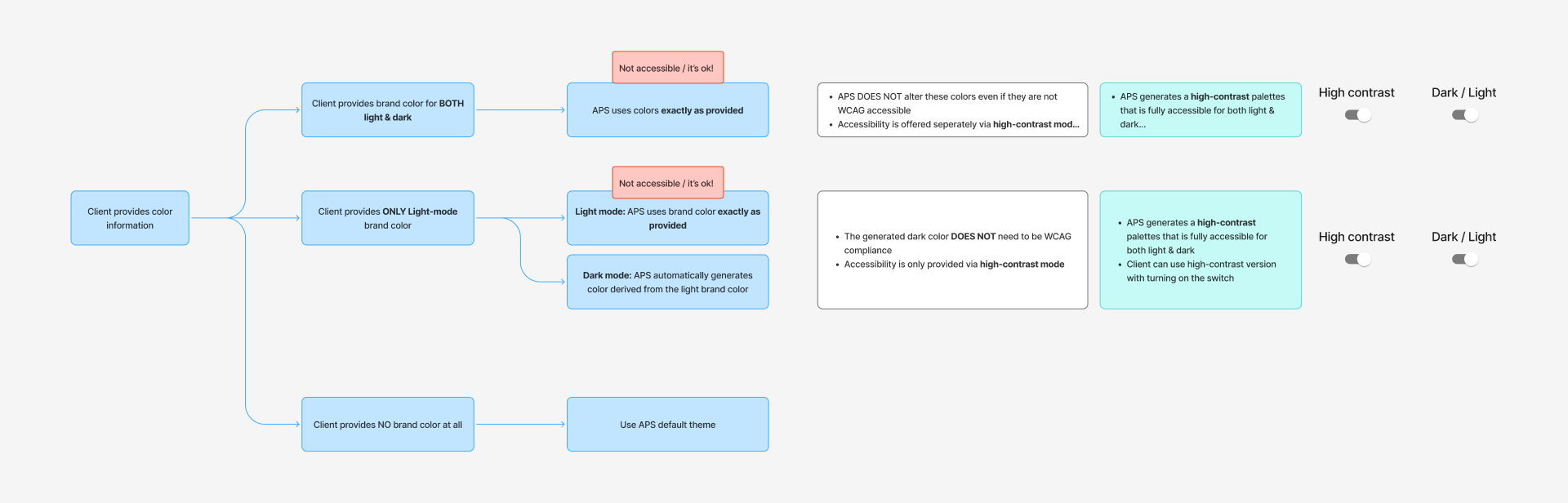
High contrast solution
How APS Design system Came to Life
To make sure the design system improvements were realistic and adopted by the team, I set up regular design system update sessions with front-end developers. In these sessions, I walked them through each component update, explained the design decisions, and discussed technical feasibility, constraints, and open questions together.
Weekly design system sessions
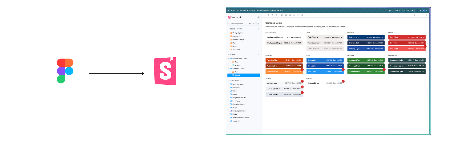
After alignment, I worked hands-on with the developers throughout implementation, refining components based on real development feedback. All finalized components were then implemented and documented in Storybook, creating a shared source of truth for both design and development.